The Influence of Colors on the Organization of Minimalist Spaces: Creating Environments that Inspire Tranquility
The Impact of Color on Mood and Space in Minimalist Design
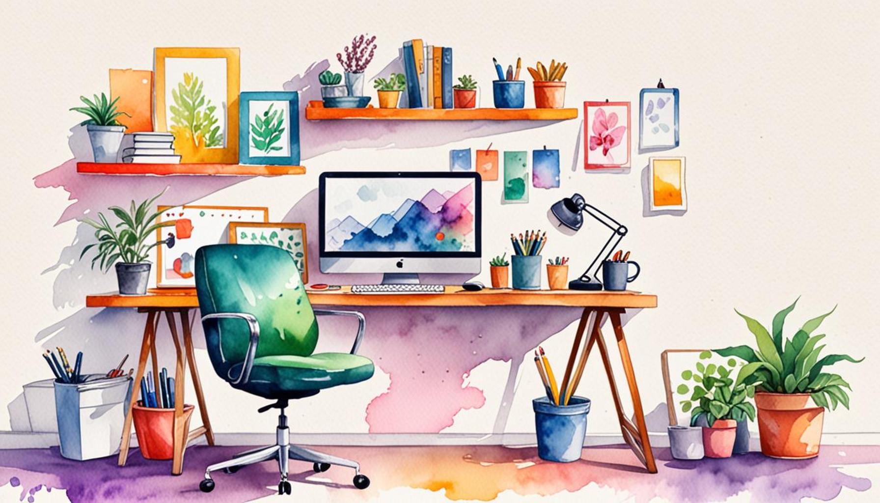
In the realm of design, color transcends simple decoration; it is integral to crafting experiences that provoke emotional responses and enhance living environments. This is particularly evident in minimalist spaces, where each design element must justify its presence, and color can significantly impact the overall mood. A well-chosen palette not only beautifies a space but can also cultivate an atmosphere of tranquility and mindfulness.
Each color carries its unique psychological weight, influencing how we perceive and interact with our environment. Let’s delve into some key colors and their emotional resonances:
- Blue: This color is widely associated with calmness and tranquility. In a minimalist living room, soft blue walls or decor can evoke a serene ambiance, ideal for relaxation after a long day. Research has shown that blue hues can lower heart rates and promote a sense of peace.
- Green: Often referred to as the color of nature, green naturally inspires feelings of balance and harmony. In a minimalist office space, incorporating green through plants or wall accents can improve focus and creativity while reducing stress, making it an ideal choice for a wellness-oriented environment.
- White: Signifying purity and simplicity, white enhances the perception of space. It can make rooms feel larger and airier, perfectly aligning with minimalist principles. This is particularly effective in urban apartments where maximizing space is crucial.
Understanding how colors interact with light and space is crucial for achieving desired effects in minimalist design. For example, rooms flooded with natural light may amplify warmer colors, thereby evoking warmth and energy, while darker rooms can benefit from lighter shades that reflect light and enhance visibility.
Moreover, the emotional impact of color can be accentuated through the use of textures and materials. A matte finish on walls can tone down the vibrancy of a color, making it more soothing, while glossy surfaces may make the same color feel more energetic and vibrant.
In this exploration, we will provide practical tips for employing color in minimalist design. From selecting the perfect shade for your space to utilizing color blocking for visual interest without clutter, readers will gain insights into how a thoughtfully designed color scheme can transform their environments. Embracing color is not merely about aesthetics; it offers an opportunity to harness emotions and create sanctuaries that nurture well-being and creativity.
DISCOVER MORE: Click here for creative ways to optimize your home spaces
Choosing the Right Color Palette for Minimalist Serenity
The selection of color palettes in minimalist design plays a pivotal role in establishing the emotional landscape of a space. As creators and homeowners strive to craft environments that promote tranquility and well-being, understanding color theory becomes essential. The goal is to create a seamless, harmonious flow that resonates with one’s inner self, transforming any area into a sanctuary.
When deliberating on color choices for a minimalist space, it’s important to recognize the psychological effects associated with different hues. The environment, often characterized by its simplicity and focus on function, can be significantly enhanced by the strategic application of color. Top color choices that contribute to a soothing ambiance include:
- Pastel Tones: Soft colors such as pale pinks, mint greens, and light yellows can introduce a gentle warmth to a minimalist space without overwhelming the senses. They evoke a sense of calm and can be combined with white or neutral tones to maintain clarity.
- Earthy Shades: Colors like terracotta, muted ochre, and soft browns connect a space to nature. These hues facilitate grounding and stability, making them perfect for living areas where relaxation is key. Earth tones can complement natural materials, amplifying their organic appeal.
- Cool Neutrals: Shades of gray and soft beige are not just practical; they serve as an elegant backdrop that allows other design elements to shine. Their versatility means they can meld seamlessly into various minimalist styles, ensuring a cohesive look while fostering a sense of calm.
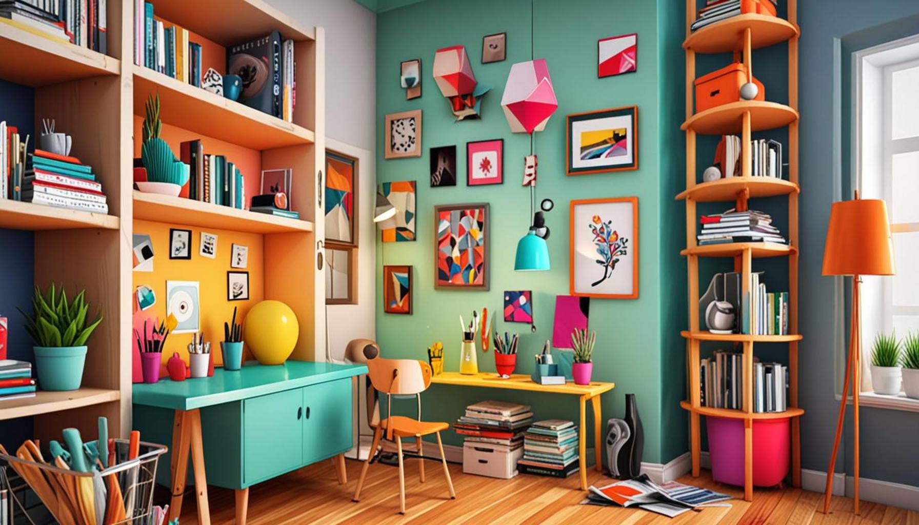
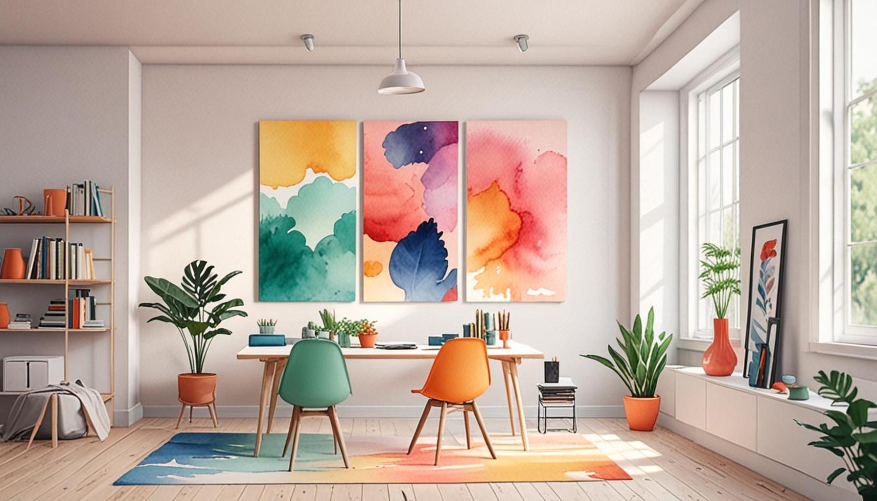
Utilizing color blocking is another powerful technique in minimalist spaces. By juxtaposing contrasting yet complementary colors, you can create visual interest without cluttering the space. For instance, a bold navy accent wall paired with light, airy furniture can deliver an enriching experience that invites contemplation and relaxation. This approach allows a minimalist aesthetic to flourish while highlighting specific areas within the room.
Besides psychological effects, the impact of color on a minimalist design is also related to the principles of light. Color saturation and brightness interact with natural and artificial lighting, leading to dramatic shifts in the space’s perception. In well-lit rooms, warm colors can seem inviting and cozy, while cooler colors, under natural light, can maintain a crisp, refreshing feel. Balancing these hues in accordance with the light available is critical for achieving the desired atmosphere.
As you contemplate color choices, consider the textures and materials that will accompany them. A space styled with minimalism in mind should utilize a limited variety of materials to maintain its streamlined appearance. Soft fabrics, wooden finishes, and natural stone can enhance the feel of the selected color palette, ensuring that even a single hue can elicit multiple emotional responses.
In conclusion, the pathway to designing serene minimalist spaces begins with a mindful selection of colors. Thoughtful color combinations, paired with an understanding of light and texture, can transform environments into tranquil retreats. Artists and designers alike are encouraged to explore the vast emotional possibilities that color introduces to minimalist spaces, paving the way for a newfound appreciation of tranquility in everyday life.
| Color Psychology | Impact on Minimalist Spaces |
|---|---|
| Calm Colors | Soft blues and greens evoke feelings of peace and relaxation, ideal for meditation spaces. |
| Warm Tones | Earthy colors like beige create warmth and a sense of security, promoting comfort in minimalist living areas. |
| Neutral Palettes | Whites, grays, and soft browns facilitate an uncluttered feeling, amplifying the sense of space. |
| Accent Colors | Pops of color can energize a space, encouraging creativity and inspiration without overwhelming the senses. |
The strategic use of color in minimalist design not only serves aesthetic purposes but also directly influences emotional responses. By implementing shades that elicit tranquility, such as soft blues and greens, one can create environments that invite serenity. Furthermore, embracing warm tones, such as earthy beige, can enhance a room’s inviting quality, establishing a sanctuary for relaxation.Moreover, a balanced approach to a neutral palette can maximize spatial perceptions, providing an illusion of openness. The inclusion of accent colors offers the potential to inspire and invigorate spaces—encouraging creative thinking without chaos. Thus, understanding the intricate relationship between color choices and emotional well-being is paramount for those looking to cultivate a calming atmosphere in minimalist spaces. This insightful connection between color psychology and minimalist design encourages readers to explore how their choices can enhance their living environments.
DISCOVER MORE: Click here to uncover effective strategies
The Role of Color in Spatial Perception and Harmony
Beyond emotional resonance and visual identity, the choice of color in minimalist spaces can significantly influence spatial perception. Color can alter how we perceive the dimensions of a room, making it feel more expansive or cozier, depending on the application. In minimalism, where every square inch counts, leveraging color strategically can enhance functionality while promoting tranquility.
For instance, utilizing lighter shades on walls and ceilings can create an illusion of height and space, making small rooms feel airy and open. Soft whites and light pastels reflect natural light, brightening corners that might otherwise feel confined or dull. Conversely, darker hues can be used to create intimacy, anchoring a space and encouraging a sense of safety and warmth. A deep green or navy-blue accent wall, for example, can serve as a commanding focal point while still allowing the surrounding minimalist features to shine.
The concept of color flow is another essential element in establishing harmony within minimalist environments. Transitions between rooms should be seamless, bridging colors that not only complement one another but also create a cohesive visual pathway. For instance, a consistent color scheme throughout adjoining spaces can foster a sense of continuity and peace, making any transition between areas feel natural. Using gradients of the same color family can help achieve this, where soft transitions uphold minimalism while enhancing tranquility.
Textural contrasts within a minimalist framework also benefit from the careful use of color. Incorporating various materials can deepen the visual interest; however, the interplay of color among these elements remains critical in maintaining harmony. A textured fabric, like a soft wool throw in a muted cerulean, can pop against a smooth, light gray couch, creating an inviting focal area without cluttering the space. These nuanced dialogues between different colors and textures infuse the environment with visual richness while adhering to minimalist principles.
Furthermore, it’s vital to consider the influence of seasonal changes on color perception. Colors react to light differently at various times of the day and throughout the seasons, shifting in tone and vibrancy. Early morning sunlight may illuminate a warm beige wall with a golden glimmer, while evening shadows may drape a room in cooler hues. This continuous evolution speaks to the dynamic nature of minimalist spaces and urges designers to factor in how color may change with time, ensuring that the chosen palette remains serene and uplifting.
Most importantly, aligning color choices with personal preference is essential. The colors that inspire tranquility in one individual might evoke a different emotional response in another. It is wise to conduct personal tests, such as creating mood boards or color swatches in natural lighting, to ascertain individual reactions to colors. Consulting psychological insights into color preferences can also enhance decision-making, enabling creators to tailor spaces that resonate deeply with their occupants.
As ongoing explorations of how color shapes minimalist spaces continue, this synergy between emotional connection and spatial organization remains paramount in creating environments that foster tranquility. Empowering individuals to engage with their spaces through color not only invites serenity into their lives but also celebrates the minimalist ideal of simplicity alongside personal expression.
DIVE DEEPER: Click here to discover the importance of free time and creativity
Conclusion: The Art of Color in Minimalist Design
In the realm of minimalist design, color emerges not merely as an aesthetic choice but as a pivotal element that shapes the very essence of a space. By understanding how different hues influence spatial perception and evoke emotional responses, designers and occupants can create environments that truly inspire tranquility. Whether it’s the use of soft pastels to enhance brightness or bold colors to instill intimacy, the strategic application of shades alters how we experience our surroundings.
The seamless flow of color across adjoining areas fosters a sense of continuity and calm, emphasizing that minimalism is as much about the visual journey as it is about simplicity. Establishing a palette that resonates personally ensures that the space aligns with individual preferences, heightening the therapeutic qualities that color can provide. As explored, factors such as seasonal changes and light variations add further depth to how color is perceived, making the design process a dynamic and ongoing exploration.
Ultimately, the influence of color on minimalism invites us to interact more thoughtfully with our environments. By engaging with colors that promote serenity and reflection, we not only enhance the functionality of our spaces but also enrich our emotional well-being. This dialogue between color, space, and emotion underscores a profound truth: that simplicity can house complexity, and tranquility can thrive amid the minimal. As we venture forward, let us continue to investigate how the art of color can elevate our minimalist spaces, transforming them into sanctuaries of peace and inspiration.